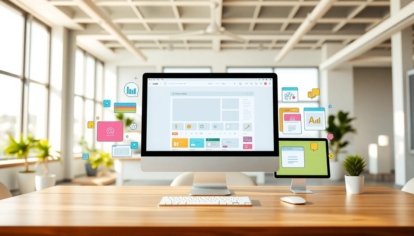
The Fundamentals of Effective Website Design
In today’s digital landscape, a well-crafted website design is crucial for businesses and individuals aiming to create a captivating online presence. A polished website not only communicates your brand’s message effectively but also serves as a powerful marketing tool that can attract and retain visitors. Understanding the fundamentals of effective website design is essential for anyone looking to make an impact online.
Understanding Key Principles
Effective website design is grounded in several core principles that guide the development and functionality of a site. Here are some of the key principles:
- Usability: The website must be easy to navigate and intuitive to use. Well-structured navigation helps users find information quickly and enhances their experience.
- Accessibility: Designing for accessibility ensures that all users, including those with disabilities, can access and benefit from your website. This includes considerations like text size, contrast, and keyboard navigability.
- Visual Hierarchy: The arrangement of elements on a page should guide the viewer’s attention to the most important parts. This includes using headings, images, and spacing strategically to create a flow of information.
- Consistency: A consistent look and feel across your website builds credibility and trust. This includes consistent use of colors, fonts, and layout styles.
- Responsiveness: A responsive design ensures that your website functions well across all devices and screen sizes, providing a seamless user experience regardless of how visitors access your site.
Essential Elements for User Engagement
To create an engaging website that achieves user interaction, consider incorporating the following elements:
- Compelling Content: Quality content that resonates with your audience is key. Engaging text, images, and videos can help convey your message effectively.
- Call-to-Actions (CTAs): Effective CTAs guide users toward desired actions, such as signing up for newsletters or making a purchase. Make these prompts visible and enticing.
- Visual Elements: Incorporate high-quality images, videos, and infographics to enhance the aesthetic appeal and convey your message visually.
- User Feedback: Integrate forms, surveys, or review systems to encourage user interaction. Feedback helps you improve the website and shows users you value their opinions.
Common Mistakes to Avoid in Website Design
Even seasoned designers can fall prey to common pitfalls in website design. Here are some mistakes to watch out for:
- Overcomplicated Navigation: A cluttered or overly complex navigation structure can confuse users. Keep navigational elements clear and organized.
- Poor Loading Times: Slow-loading pages can deter users. Optimize images and use effective coding practices to enhance page speeds.
- Neglecting Mobile Users: With a significant portion of web traffic coming from mobile devices, failing to design for mobile can result in lost opportunities. Ensure your design is responsive.
- Ignoring SEO: Failing to consider SEO during the design phase can limit your visibility in search engines. Optimize your website for search from the onset.
Enhancing User Experience Through Responsive Web Design
Defining Responsive Design for Modern Devices
Responsive web design refers to an approach where a website’s layout and elements adjust dynamically to fit the screen size and orientation of the device being used. This is vital in providing a consistent experience for users, regardless of whether they are using a smartphone, tablet, or desktop computer. The concept relies on flexible grids, images, and CSS media queries to achieve adaptability.
Best Practices for Mobile Optimization
As mobile usage continues to soar, implementing best practices for mobile optimization has never been more critical:
- Prioritize Content: Ensure the most important content is visible without excessive scrolling. Keep essential information above the fold.
- Optimize Touch Elements: Since mobile devices rely on touch interactions, ensure all buttons and links are easily clickable, with appropriate finger-sized spacing.
- Minimize Pop-Ups: While pop-ups can be effective for leads, avoid intrusive pop-ups that can disrupt the user experience on mobile devices.
- Test on Various Devices: Regularly test your site on different mobile devices to ensure compatibility and identify any issues that may arise.
Tools and Frameworks for Creating Responsive Websites
Several tools and frameworks can streamline the process of building responsive websites:
- Bootstrap: One of the most popular CSS frameworks, Bootstrap provides a responsive grid system and pre-designed components that help accelerate the development process.
- Foundation: Similar to Bootstrap, Foundation offers a mobile-first approach to design with customizable components.
- Flexbox: A CSS layout model that provides an efficient way to layout and align items within a container, offering responsive designs with ease.
- Media Queries: These CSS techniques allow different styles to be applied each time a condition in the query is met, enabling tailored designs for various screen sizes.
Incorporating SEO Best Practices in Website Design
Integrating SEO from the Ground Up
Integrating SEO into your website design ensures that your site is not just visually appealing, but also findable on search engines. This can be achieved by:
- Choosing the Right Keywords: Research and identify keywords relevant to your business that potential visitors are likely to search for.
- Utilizing Clean Code: Clean, semantic code allows search engines to better understand your site structure, which can enhance your SEO ranking.
- Optimizing Meta Tags: Implement relevant and concise meta tags including title tags and descriptions to improve click-through rates from search engine results.
Keyword Optimization Techniques
Keyword optimization is crucial for driving traffic to your website. Here are some techniques to consider:
- Natural Keyword Placement: Avoid keyword stuffing; instead, integrate keywords in a natural context within content, headings, and image alt text.
- Long-Tail Keywords: Targeting long-tail keywords can help connect with niche audiences and improve your chances of ranking due to lower competition.
Measuring Performance with Analytics Tools
To assess the effectiveness of your website design and SEO efforts, utilize analytics tools:
- Google Analytics: Track user engagement, bounce rates, and other metrics to evaluate how visitors interact with your site.
- Google Search Console: Monitor your website’s performance in search results and optimize accordingly based on user search data.
- A/B Testing: Test variations of your pages to determine which designs or content lead to better performance and conversions.
The Role of Visual Aesthetics in Website Design
Choosing Color Schemes that Captivate
The colors chosen for a website can evoke emotions and influence user behavior. Here are some guidelines for choosing effective color schemes:
- Create Contrast: Utilize contrasting colors for background and text to ensure readability.
- Use Color Psychology: Different colors are associated with specific emotions—understanding this can aid in selecting a color palette that aligns with your brand messaging.
- Limit Your Palette: A limited color palette can enhance visual cohesion and make the design feel more intentional.
The Impact of Typography on Readability
Typography is another essential aspect of visual design that significantly impacts readability and user engagement. Keep these points in mind:
- Font Choices: Use web-safe fonts that render well on various devices and sizes. Consider limiting the number of fonts used to maintain visual coherence.
- Text Size and Line Spacing: Optimal text size (around 16px for body text) and appropriate line spacing can improve readability and user comfort.
Creating Balance with Layout and White Space
Effective use of layout and white space can greatly enhance a website’s user experience:
- Grid Systems: Utilize grid systems to create a balanced and organized layout that guides the user’s eye across the page.
- Incorporate White Space: White space can prevent clutter and help users focus on essential elements, improving overall site usability.
Future Trends in Website Design
Leveraging AI for Personalized User Experiences
The integration of artificial intelligence (AI) in website design is poised to revolutionize user experiences. Through AI-driven insights, designers can create personalized experiences tailored to individual visitor behaviors and preferences, enhancing engagement and satisfaction.
The Rise of Minimalism and Simplicity
Minimalism continues to be a significant trend in web design, focusing on simplicity and functionality. By stripping away unnecessary elements, minimalist designs emphasize key content and functionalities, resulting in a clean and effective user experience.
Adapting to Evolving Web Technologies
The digital landscape is perpetually evolving, and staying ahead requires adaptability. Emerging technologies such as virtual reality, augmented reality, and progressive web apps are beginning to influence web design trends. Keeping an eye on technological advancements will ensure your website remains relevant and effective in engaging users.